In the Omnissa Access console Monitor pages, you can view the user engagement dashboard to monitor user and group activities; monitor the health of the service, and create and view reports that track user and group activities.
Monitor Users and Resource Usage from the Omnissa Access Dashboard
The Dashboard in the Omnissa Access console displays information about users and resources. You can see who is signed in, which applications are being used, and how often the applications are being accessed. You can create reports to track users and group activities and resources usage.
The time that displays on the User Engagement Dashboard is based on the time zone set for the browser. Refresh the dashboard to update the screen with the latest changes.
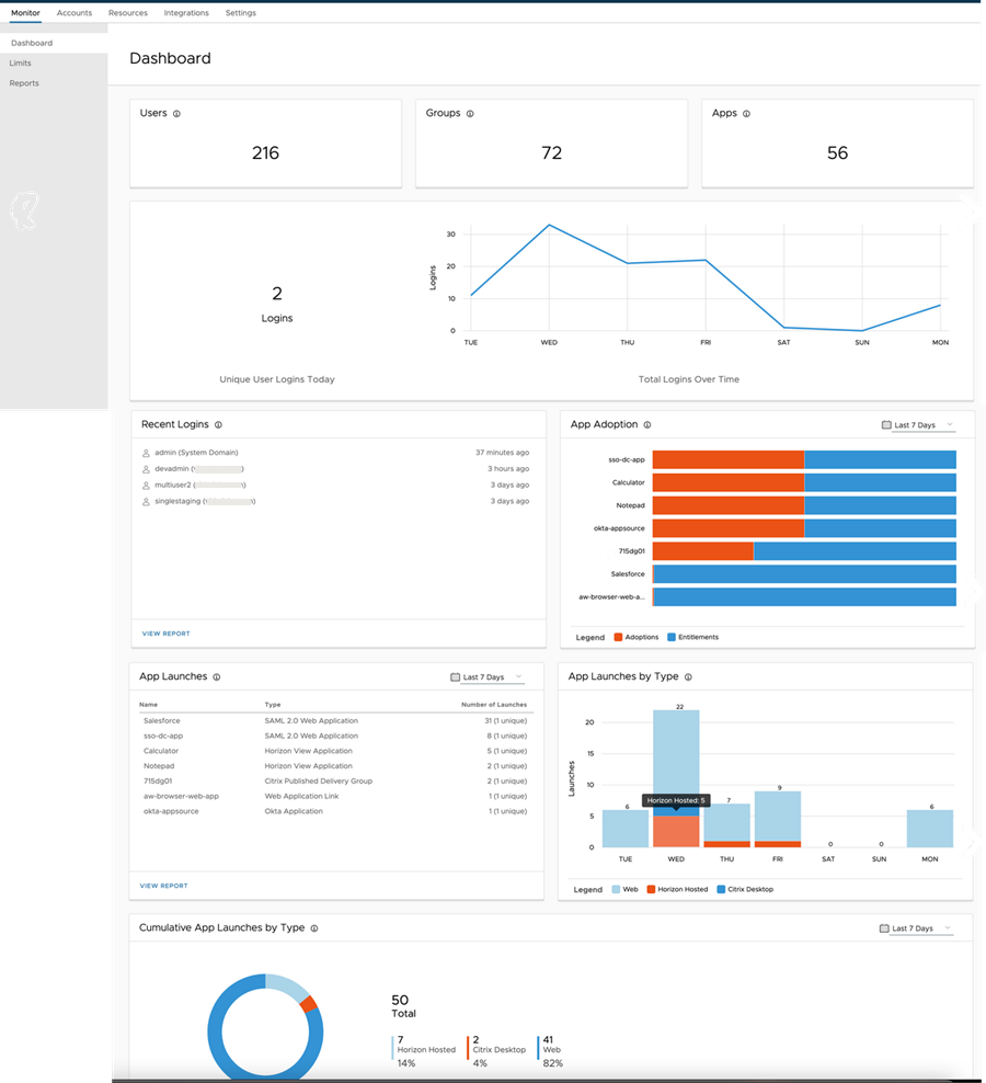
- The first row in the Dashboard displays the total number of users and groups that are set up in Omnissa Access and the total number of applications that are in the catalog.
- The next section displays the number of unique users that logged in on that day. A time-line that shows the number of daily login events over a seven-day period displays next to Logins. Point to one of the points in the graph to see the number of users that logged in on that day.
- The Recent Logins section shows the most recent unique users that logged into Omnissa Access. You can click VIEW REPORT to create an Audit Events report that shows the users who logged in over a range of days.
- The App Adoption section displays a normalized horizontal stacked bar graph that shows the specific apps people are using. Point to the bars to see the tool tip that shows the actual number of adoptions and entitlements. Expand the drop-down menu on the right to view this information over a day, a week, a month, or 12 weeks.
- The App Launches section displays the number of times the specific apps were launched. Expand the drop-down menu on the right to select to view this information over a day, a week, a month, or 12 weeks. You can click VIEW REPORT to create a Resource Usage report that shows app, resource type, and number of users' activity over a range of time.
- The App Launches by Types section displays a vertical stacked bar graph grouped by app type of the number of times that apps were launched over a seven-day period. Point to a specific bar to see a tool tip showing which type of apps were being used and the number of apps that were launched on that day.
- The Cumulative App Launches by Type pie chart displays resources that have been launched as a percentage of the whole along with the actual number of launches. Point to a specific section in the pie chart to see the actual number by type of resources. Expand the drop-down menu on the right to select to view this information over a day, a week, a month, or 12 weeks.
Was this page helpful?